Intelligent Solutions to Complex Communications
BLUEHAUS.COM
Google+
Google+
We belive in telling stories through authentic words and images that reveal who you are. We speak in your voice and capture your culture in resh ways that strengthen connections between people, organizations and your brand.
Bluehaus Communications is a multidisciplinary, creative design studio. Communicating visually through all forms of media, we work with our clients to understand their customers and we think strategically to get them to their goal. We combine rich experience with deep thinking to create fresh, distinctive design solutions that deliver business impact. Our work elicits strong human connections, striking a balance between logic and inspiration as well as reason and emotion. We help our clients connect with their audience through work that’s memorable, motivating and, most importantly, authentically linked to tangible business strategies.
With over a decade of experience, we operate at the leading edge of our field, providing powerful concepts for marketing, advertising, design and digital media. Bluehaus strives to synthesize visual exploration and smart design solutions while maintaining the highest level of design expertise and freshness of approach. Whatever the creative challenge, the goal is the same: engage the target audience so the client’s message is seen, heard, remembered and acted upon.
Our studio is passionate about creating great brand solutions for our clients and we hope to be a part of your next solution. To find out more about what we can do for you, please contact us, we’d love to hear from you!
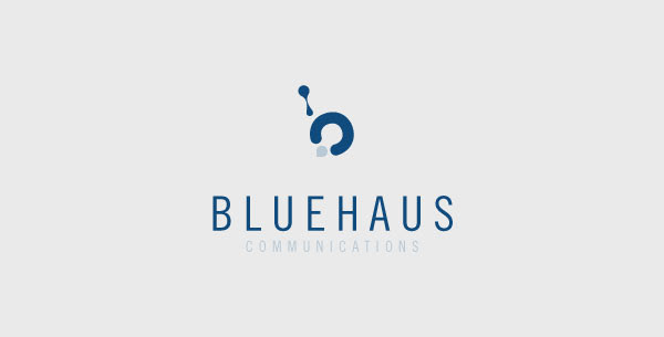
Let me start by explaining the name first. "bluehaus" is a made up word that I created by combining a lot of things about me and things I enjoy. Many people notice the similarities to the German school Bauhaus. The Bauhaus style became one of the most influential currents in Modernist architecture and modern design and I quick enjoy it. I have German blood in me and enjoy the colour blue. I threw them all together and came up with the word "bluehaus".
As for my mark, it's a combination of a couple of different things. The first and probably the most obvious is the overall shape of a lower case "b". A friend once told me that I must be dripping with creativity and that always made me laugh. So I used a drop to create the upper part of the mark. The lower part symbolizes the process of taking my clients all the way around from point A to point B making sure nothing is overlooked in every project. In a nutshell, I think that's about it! Hope you enjoy my mark and appreciate all the thought that went into it.
What Makes Us So Special?